Samaaro + Your CRM: Zero Integration Fee for Annual Sign-Ups Until 30 June, 2025
- 00Days
- 00Hrs
- 00Min

Here’s what I see happen constantly. Teams wrap an event and immediately dump numbers into a slide deck. Check the box. Move on.
That’s not reporting. That’s theater.
The difference between a throwaway report and one that actually shapes your strategy? The first documents what happened. The second tells you what to do about it.
Most teams don’t have time to do the second thing. They’re exhausted post-event, firefighting, already planning the next one. So reports become a formality. A checkbox. Nobody reads them. The insights disappear. And then you run your next event almost identically to the last one, hoping for different results.
That’s insane.
A real post-event evaluation report? It connects event data directly to revenue. It tells your CMO whether this event should run again or get killed. It tells your marketing team which promotional channels actually drove quality leads. It tells your ops team exactly which logistics broke and how to fix them.
And it does all this in a format people actually read.
This guide walks you through building one. Not the 40-page data dump your CEO will skim. I’m talking about a strategic document that shapes your event program for the next three years.
You can’t measure what you didn’t define.
I mean this literally. If you wait until the event ends to decide what “success” looks like, you’re going to retrofit a narrative around whatever data you collected. It’s human nature.
The fix? Work backward from your business goal. Then translate it into measurable KPIs.
Let’s say your goal is “grow enterprise pipeline.” Don’t stop there. Drill deeper:
See the difference? That’s specificity. That’s measurable.
Here’s what this looks like in a template you can steal:
| Business Goal | Target KPI | Number | Measurement Method |
| Generate enterprise pipeline | MQLs created | 500 | CRM data |
| Pipeline value | $2.5M | Weighted by stage | |
| Cost per MQL | $400 | Event spend divided by MQLs | |
| Drive sponsor ROI | Sponsor satisfaction | 85%+ | Post-event survey |
| Sponsor renewal intent | 80%+ | Direct ask | |
| Increase brand credibility | LinkedIn impressions | 250K | Native analytics |
| Media mentions | 15+ | Social listening |
I’ll be honest. This step gets skipped because it’s boring. Nobody wants to sit in a conference room for an hour defining KPIs. But this is the difference between a report that matters and one that doesn’t.
The other thing that happens? Teams define vague KPIs. “Increase engagement.” “Boost ROI.” “Generate leads.” Those aren’t KPIs. Those are wishes.
A real KPI is testable. Measurable. Tied to something in your CRM or revenue system.
Why does this matter? Because when your CMO reads your report, they’ll skip straight to this section. “Did we hit our KPIs?” If yes, you’re golden. If no, you’d better have a solid explanation.
Most teams nail one side and completely botch the other.
They either dump a spreadsheet with 47 rows of registration data, or they cherry-pick one glowing testimonial and call it a win.
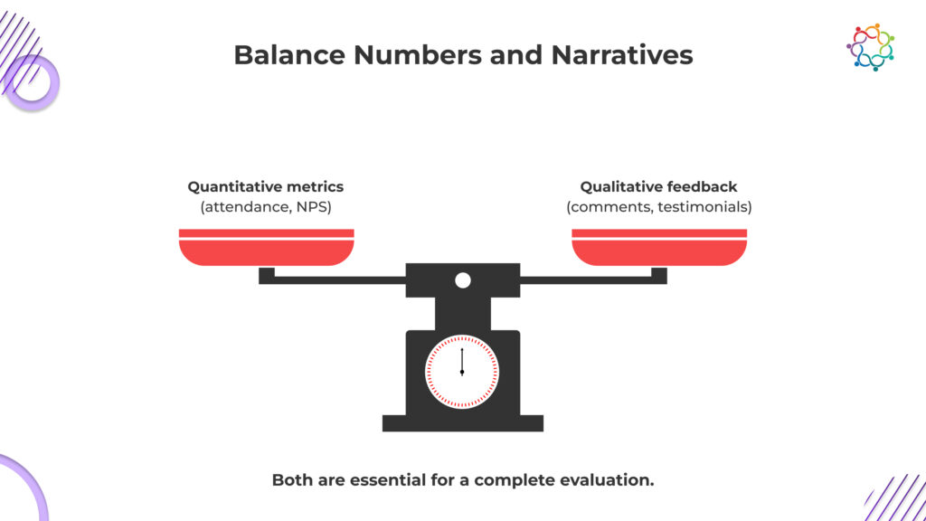
You need both. Numbers tell you what happened. Stories tell you why.
Let me break this down:
Quantitative data (the what):
Qualitative data (the why):

Here’s where it gets interesting. Your keynote had low attendance (quantitative fail). But why? The qualitative data tells you. Attendees said the session description was “too vague” or it “clashed with the AI workshop next door.” That’s gold. Now you know exactly what to change.
Another example: Your sponsored booth got no foot traffic (bad metric). But visitors who did stop by said “This sponsor solved a problem we’ve had for two years” (great feedback). So the issue wasn’t relevance. It was visibility or booth placement. Different fix entirely.
This is why both matter. Quant gives you the score. Qual explains the score.
A report is only useful if stakeholders read it.
And stakeholders don’t read 40-page documents.
Structure yours like a story. Lead with the verdict. Then back it up. Don’t bury the answer on page 27.
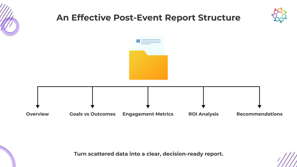
Here’s the structure I recommend:

Don’t bury the lead. Start with:
Establish context:
Line them up. No spin.
| Target | Achieved | Gap |
| 400 MQLs | 520 MQLs | +30% |
| $2.0M pipeline | $2.4M | +20% |
| NPS 60 | NPS 65 | +5 |
| $200K sponsorship | $240K sponsorship | +20% |
If you missed a goal, say so. You’ll explain why in the feedback section.
Show the full funnel:
Use charts here. A bar graph showing session attendance is infinitely more impactful than a list.
Synthesize both numbers and stories:
This is where your qualitative data shines. Real attendee quotes carry weight. “The AI panel changed how I think about our AI strategy” is worth more than “Attendee satisfaction was high.”
This is where execs lean forward. Show the full picture:
Example:
Ticket revenue: $120K
Sponsorship revenue: $60K
Total event cost: $180K
Net profit: $0 (looks bad)
But wait. Pipeline influenced: $2.4M. Cost per MQL: $346. Sponsor renewal rate: 80%.
Now it looks different.
End with actions. For each gap, propose a fix:
These aren’t suggestions. They’re commitments. You’re telling leadership: “Here’s what happened, here’s why, and here’s exactly what we’re fixing.”
Numbers without visuals are forgettable. Visuals without numbers are fluff.
What charts matter?
Registration vs. Attendance Rate (bar chart). If it’s 72%, you’re good. If it’s 45%, you’ve got a problem with event relevance or your reminder strategy didn’t work.
Session Attendance (bar chart). Rank by size. You’ll see immediately which content resonated and which didn’t. Use this to shape next year’s agenda.
NPS Trend (line graph). If you’ve run 3 or 4 events, stack them. A rising trend tells the board you’re getting better. A flat line tells them you’re stagnant.
Lead Quality Distribution (pie chart). What percentage were enterprise? Mid-market? SMB? Did you actually hit your ICP?
Comparisons that land:
These stick with stakeholders. They show progress. They justify future investment.
Not everyone reads the same report.
For your CMO/CEO: Lead with ROI and pipeline. Show how this event fits into broader demand gen. Answer the binary question: “Run this event again?”
For your marketing team: Focus on campaign performance. Which channels drove quality registrations? Which segments engaged most? Which promotional messages converted best?
For your ops team: Logistics feedback, satisfaction scores, bottlenecks. What broke? What worked? What needs to be different?
Pro move: Build one master report. Then create 3 condensed versions. CMO gets 5 pages. Marketing gets 12. Ops gets 10.
Each one has the same KPI summary at the top. Then different sections dive deeper into what each team cares about.
Here’s a filled-in example. Steal it directly:
EVENT: Enterprise Tech Summit 2025
DATES: March 15-16, 2025
FORMAT: Hybrid
LOCATION: San Francisco Convention Center + Zoom
REGISTRATIONS: 850
ACTUAL ATTENDANCE: 600 (71% show rate)
VIRTUAL ATTENDANCE: 340
| Goal | Target | Achieved | Status |
| Lead generation (MQLs) | 400 | 480 | Hit (120%) |
| Pipeline influence | $2.0M | $2.45M | Hit (123%) |
| NPS | 60 | 65 | Hit |
| Sponsorship revenue | $200K | $240K | Hit (120%) |
Keynote: 580 attendees (97% of total)
AI Panel: 340 attendees (highest engagement, 9.2/10 rating)
Cloud Migration Workshop: 120 attendees (lowest, scheduling conflict)
Networking breakfast: 450 attendees (84% satisfaction)
Poll participation: 65% of attendees voted at least once
Chat volume: 4,200 messages across all sessions
Survey response: 42% (industry average is 28%)
What worked:
“The AI panel was the most valuable conference session I’ve attended.” (AI panel averaged 9.1/10)
“Networking with peers in the same space was worth the flight alone.” (Networking breakfasts: 88% satisfaction)
“Logistics were flawless.” (Venue and operations: 91% satisfaction)
What didn’t:
“Too many session conflicts. I wanted to attend 3 talks but had to choose.” (35% mentioned this)
“Virtual attendees felt like second-class citizens.” (28% of online participants mentioned this)
“Breakout sessions were too technical for C-level people.” (18% of senior leaders said this)
Ticket sales: $180K
Sponsorship: $240K
Total revenue: $420K
Event costs:
Venue and catering: $90K
Speakers: $45K
Tech (Samaaro, Zoom, streaming): $35K
Marketing: $25K
Staff and logistics: $40K
Total cost: $235K
Net profit: $185K
ROI: 79% (not counting pipeline influence, which adds another 260% when factored in)
Manually assembling evaluation reports is brutal. You’re pulling data from registration systems, your CRM, survey tools, spreadsheets. Then stitching it together.
With Samaaro, here’s what changes:
All data flows into one dashboard. Registration, attendance, polls, chat, surveys. No manual exports.
Pre-built templates. Start with one built for event evaluation, customize it to your KPIs.
CRM integration. Leads get scored automatically. Pipeline attribution happens in real time.
Customizable stakeholder reports. One click generates separate reports for your CMO (ROI focus), marketing team (campaign focus), and ops team (logistics focus).
Survey synthesis. Open-ended feedback gets tagged by theme automatically.
Our customers build executive-ready reports in 4 to 5 hours instead of 2 to 3 weeks.
That’s the difference between reporting as a burden and reporting as a strategic process.
Does the evaluation process sound overwhelming? Download our Post-Event Evaluation white paper or explore Samaaro’s reporting capabilities today.
Q: What exactly is a post-event evaluation report and why does it matter?
A: It’s a document that measures what your event achieved against what you planned to achieve. Without it, every event is a one-off. With it, you build institutional knowledge. You learn which speaker formats work. Which audience segments convert to customers. Which promotional channels work best. Over 3 to 5 events, that knowledge becomes your competitive edge.
Q: What KPIs should I set before the event?
A: Tie them to business outcomes. Don’t track “attendees” track “qualified leads.” Don’t track “sessions held” track “sessions attended by target accounts.” If your event is meant to close deals, define pipeline created and cost per opportunity. Make everything testable and tied to your CRM.
Q: How do quantitative and qualitative data work together?
A: Quant answers “What happened?” (600 people attended, 65 NPS). Qual answers “Why?” (attendees said the keynote was “transformative,” but networking was “rushed”). Together, they’re complete. Quant alone is lifeless. Qual alone is anecdotal.
Q: What sections must my report include?
A: Start with an executive summary. Then event overview, goals vs. outcomes, engagement metrics, feedback, ROI analysis, and recommendations. This mirrors how executives think: “Did we win? Why or why not? What’s next?”
Q: How do I customize reports for different audiences?
A: Build one master report. Slice it three ways for CMO (1-2 pages, ROI focus), marketing (4-5 pages, campaign focus), and ops (3-4 pages, logistics focus). Every stakeholder sees what lets them decide in their domain.
Q: How do I calculate ROI?
A: ROI = (Revenue Generated minus Event Cost) divided by Event Cost. Revenue includes tickets, sponsorships, and attributed deals. Be transparent about your attribution model. “We credit 40% of deals closed in Q2 to this event” is different from “We generated $5M in pipeline” with no context.
Q: Should I evaluate every event or just big ones?
A: Every event. Scale the depth to the size. A lunch and learn gets a 2-page debrief. A 1,000-person conference gets a 20-page evaluation. Consistency means your knowledge compounds.
Q: When should I deliver the report?
A: Within 7 to 10 business days. This keeps data fresh and insights sharp while stakeholders are invested.
Q: What mistakes do teams make?
A: Using vanity metrics instead of quality metrics. Skipping goal comparisons. Writing 40-page documents nobody reads. Delivering recommendations nobody owns. Ignoring negative feedback instead of treating it as a roadmap for improvement.
Q: How do I handle underperformance?
A: Present every gap as a learning opportunity with a fix. Don’t say “Networking was rushed.” Say “Attendees rated networking 6.2/10 and mentioned it was too short. We’re extending to 60 minutes and adding AI-powered matchmaking.”
Q: What’s the difference between a recap and an evaluation report?
A: A recap describes what happened. An evaluation report measures what happened against what you planned, explains why, and recommends what to do differently next time. A recap is a summary. An evaluation is a planning document.

Samaaro is an AI-powered event marketing platform that enables marketing teams to turn events into a measurable growth channel by planning, promoting, executing, and measuring their business impact.
Location


© 2026 — Samaaro. All Rights Reserved.