Samaaro + Your CRM: Zero Integration Fee for Annual Sign-Ups Until 30 June, 2025
- 00Days
- 00Hrs
- 00Min
1
2
3
4
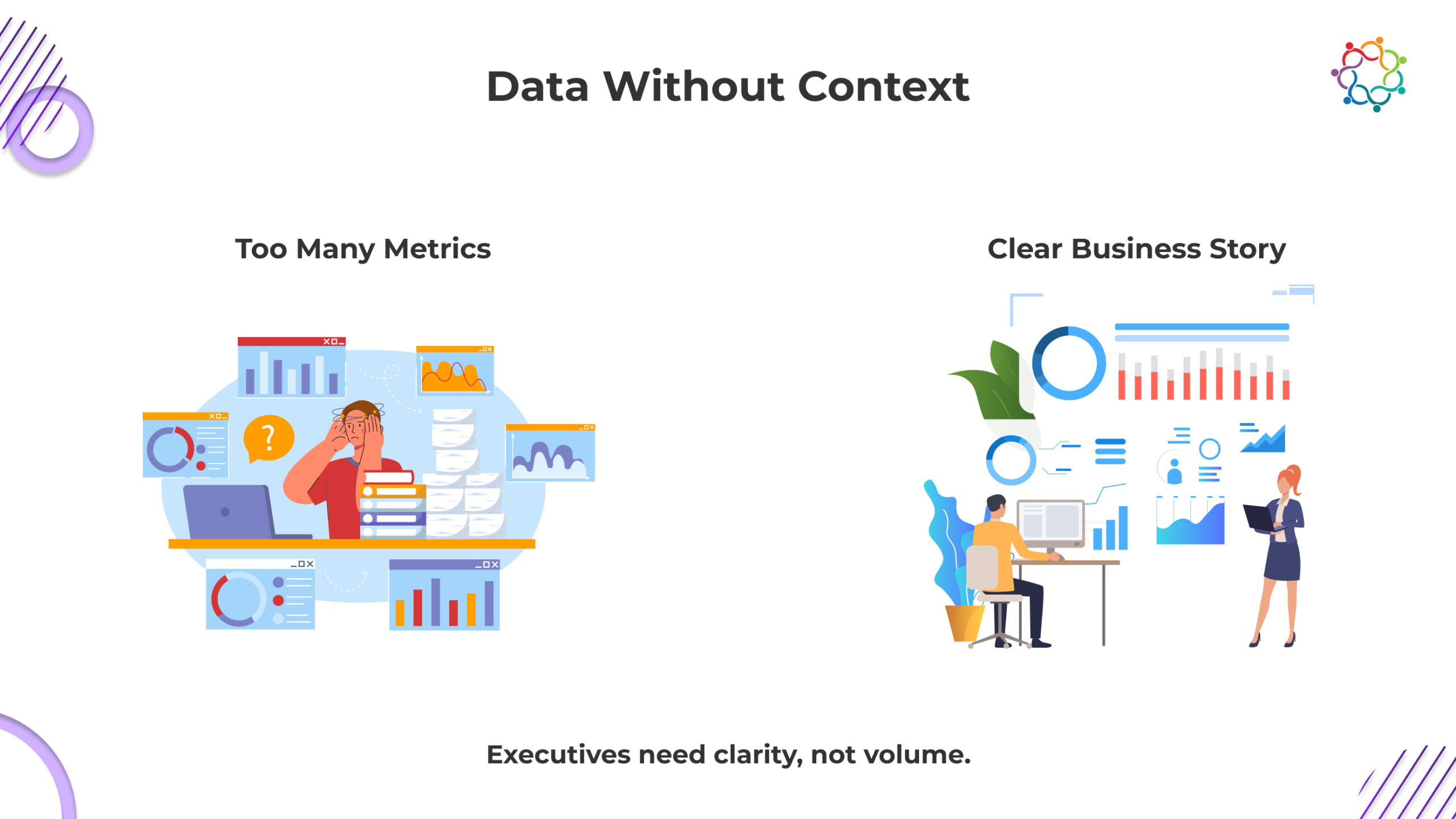
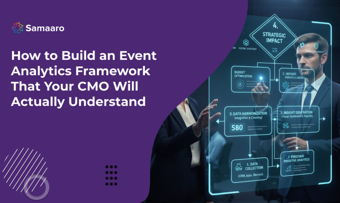
Event teams are now faced with more data than ever. Registration figures, heatmaps, dwell times, content interactions, meeting bookings, and pipeline attribution all live inside more sophisticated event systems and technology platforms than ever before. And, despite this abundance of information, most event reports don’t really matter to executives. CMOs don’t care for raw data, they want clarity, storytelling, and alignment with business goals.
The issue is not the lack of data; the issue is the lack of translation between operational metrics and strategic impact. Creating an event analytics framework that CMOs can utilize is the answer. The framework organizes information into a way in which executive audiences can easily understand and act upon it.
At the core of every event analytics framework is KPI alignment . Before considering charts, dashboards or metrics, analysts must ask the most important question: what does the business care about? CMOs tend to assess event success through three lenses, brand, pipeline, and audience growth.
These metrics assess whether the event increased the attendee’s perception of the brand’s awareness and authority. The data here may include the number of sessions attended by the attendees on thought-leadership topics, mentions on social media, number of views on thought-leadership content, ratings of speakers, and sentiment trends. On an important thought leadership topic, try not to drown out the report with a lot of granular engagement metrics, simply highlight signals that suggest the brand’s story resonated with the appropriate audience.
CMOs need to understand event conversion through revenue. This will include booked meetings, conversion MQL – SQL, acceleration of deals and influenced pipeline. The goal again is not that you document all sales activities or reports but instead boil them down to a concise story to tell. Did the event attract the right accounts, and did it move them closer to a decision?
Enterprises care about building long term communities. Metrics like first-time attendees, returning attendees, new subscribers to the content, progression to other brand touchpoints all allow CMOs to speak to whether a specific event exceeded their audience. When you report on audience growth KPI frame this layer of feedback through retention trends and long-term engagement.
Aligning KPIs to these three buckets will help ensure your analytics framework is speaking the language of executive leadership your business is already using. If CMOs see data framed in context they are far more likely to engage deeply.
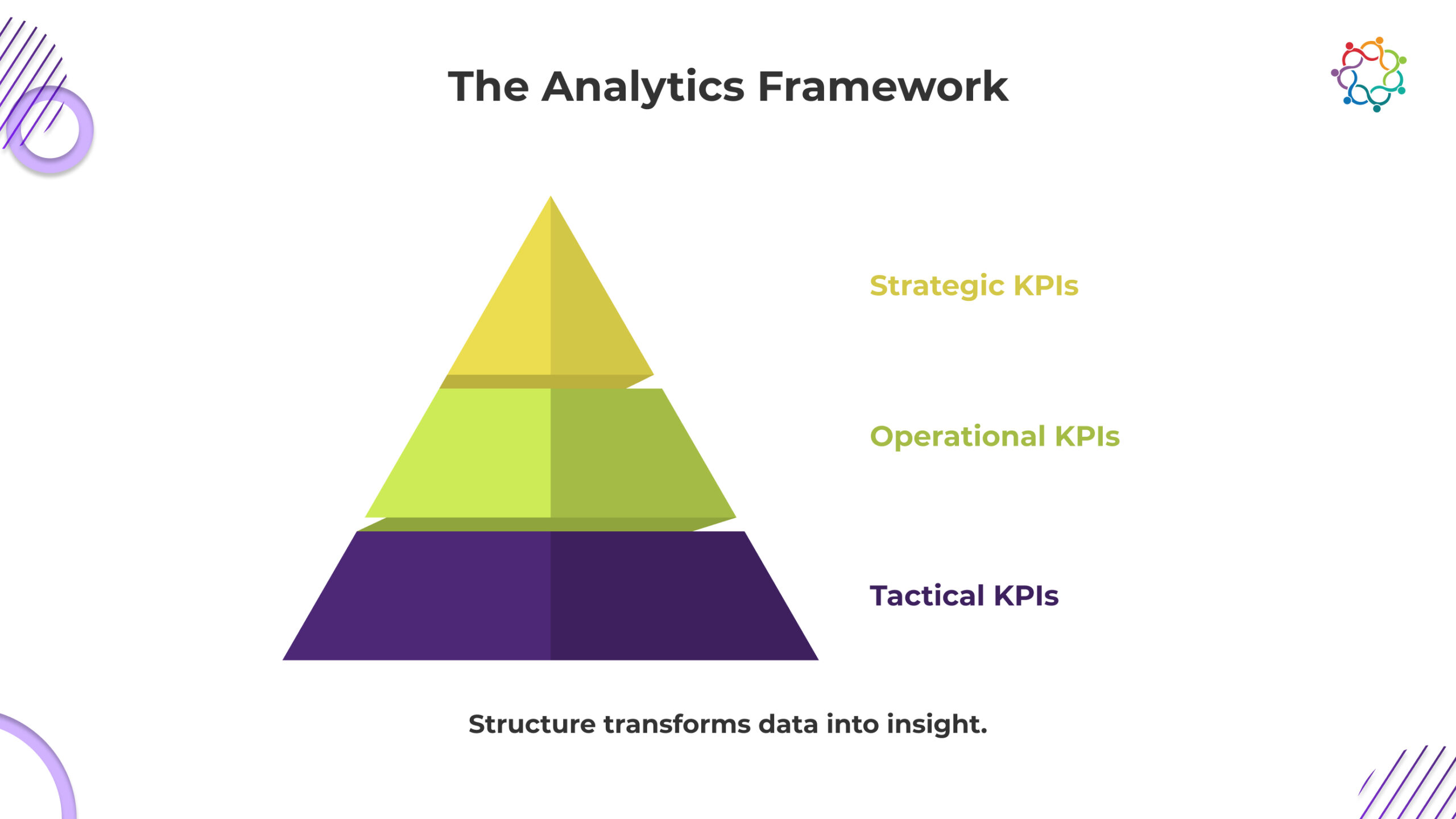
After determining KPIs, the next focus is creating an architecture that aligns tactical performance with strategic results. The three-tiered structure is best for event in your analytics: tactical, operational and strategic.
This level contains more fundamental indicators, such as registrations, attendance rate, session engagement, content engagement and app utilization. The tactical metrics allow analysts to review what happened during the event but seldom gets the full story at an executive level. Nevertheless, tactical metrics are still important because they create the scope to support higher level deduction.
This level connects audience behaviors to business outcomes. Examples of operational metrics are booth conversions, meetings booked, CRM enrichment, influenced opportunities and content-based lead progressions. Operational metrics sit in the middle, linking engagement metrics to revenue, demonstrating how those interactions influenced where buyers go next.
This is where CMOs focus the majority of their energy and time. Strategic metrics are pipeline contribution, ROI, retention habits, customer expansion opportunities, and incremental brand lift over a period of time. The strategic metric is the “so what” metric; what does this mean for the business?
Using these three levels to organize your analytics framework creates a logical line of sight from the activity level to the enterprise level outcomes. Refrain from labeling tactical and operational metrics as simple activities rather than intermediate business outcomes, then CMO or executive can quickly scan the strategic metrics first and dive down to lower levels only as necessary. Using this hierarchy enhances the intuitiveness of the report, enhances digestibility, and aligns executive’s priorities.
Even the most useful metric will be devalued if it’s poorly visualized. Effective visualization translates our complex datasets and reports into crucial intelligence that’s far easier to read through and interpret. When designing dashboards for an event or for use in an executive presentation, the most important design principle is clarity.
When dealing with executives, resist the temptation to show so many charts and chase with a small set of relevant data visuals. Instead, focus on the stories and importance stated with fewer visuals, but with great impact.
Also, use color coding across all data visualization so that the leaders and audience can look at a visualization and quickly relate that to a standard across other visualizations. For example, you might use blue for engagement, green for pipeline, and grey for operational measures. So, if you are showing a chart that relates to engagement, should be color coded blue in a title and/or legend. In that way, when the CMO looks at each data visualization, he/she can quickly relate the visual to one of the variables, to be on the lookout for engagement level.
Hierarchy matters. Each reporting section should start with a headline metric and a related chart. For example, if your strategic KPI is “₹12 crore in influenced pipeline,” relate the number with subsequent cohort, session related charts, or interactions related to that number. This accomplished two things; it communicates the fact, but also the story behind the number.
Finally, eliminate operational terminology from your analytics. Use “time spent at priority content areas” not “dwell-based heatmap segmentation.” Use, “how engagement influenced opportunity progression,” not, “multi-touch attribution variance.” Domain knowledge in business outcomes, not differentiated by operational analytics terminology.
To clarify that a solid event analytics framework provides insight about more than performance, it provides insight to help drive better decisions. CMOs couldn’t care less about pages of metrics, they want actionable recommendations. Analysts should interpret the data and thoughtfully explain what needs to change for the next event.
For example, if there is strong behavioral interest from attendees in certain industry-specific listening sessions and weaker attendance at generic product demonstrations, there would be a recommendation to restructure program content around attendee vertical priorities. If the behavior-based, CRM-mapped engagement showed that mid-market accounts demonstrate a stronger influence over pipeline than enterprise accounts, the next order of business is to modify targeting or bring sales into planning sooner in the pre-event stage.
This recommendation should be framed in a way that it presented in, “forward looking” language:
Examples of forward-looking recommendations:
When insights provide a clear path into next steps, executives will see and articulate their value in analytics within their company very quickly. The goal is to shift the conversation from reporting what happened, to advising what should happen next.
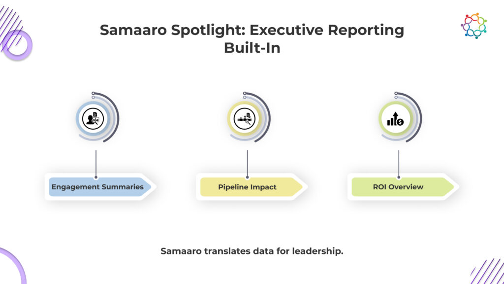
Building an event analytics framework only works if the underlying system translates raw signals into strategic clarity. Samaaro is engineered around the same hierarchy CMOs use to evaluate events: brand lift, pipeline movement, and audience growth.
Instead of handing executives dozens of tactical charts, Samaaro condenses five data sources, registration, engagement, behavioural intent, CRM movement, and ROI, into story-first dashboards that answer the questions CMOs actually ask:
Did we attract the right audience?
Samaaro links registration and behavioural patterns to ICP profiles, industry clusters, and account lists, surfacing whether the event reached the intended market.
Did the event change buyer behaviour?
Session-level dwell time, repeat interactions, and content pathways are summarised as signals of intent, not as isolated heatmaps.
Did we create sales momentum?
Opportunity movement, deal acceleration, and account scoring are tied directly to engagement patterns, giving a precise view of influence instead of “we generated 400 leads.”
What should we do next?
Samaaro auto-identifies high-intent accounts, underperforming sessions, content that created lift, and gaps in audience fit, turning dashboards into immediate recommendations.
Every insight is organised by the same three-tier structure used in your framework:
This makes Samaaro’s reporting instantly readable for CMOs, who scan the strategic layer first and drill into the underlying evidence only when necessary.
Samaaro doesn’t just present data, it tells the business story of the event, in the format executives already think in.
An effective event analytics framework simplifies the complexity of reframing event data and aligning all KPIs to business goals, displaying data intuitively in tiers, visualizing insights effectively and converting metrics into action. CMOs do not ask for raw numbers, rather a story they can trust that will articulate how the event is going to contribute to brand equity, pipeline movement and long-term growth of the audience. When event analysts create a framework that speaks this ‘language’ of trust, data goes from being informative to transformational.


