Samaaro + Your CRM: Zero Integration Fee for Annual Sign-Ups Until 30 June, 2025
- 00Days
- 00Hrs
- 00Min
You can’t email a buying committee into a room. You can invite one.
You’ve been chasing the same twenty enterprise logos for two years. A room, not another email, is what finally gets you in.
For IT services firms and systems integrators, the hardest part of enterprise selling isn’t the pitch. It’s getting in front of the people who decide, when those people never open a cold email and the deal touches a dozen stakeholders. Forrester’s State of Business Buying, 2026 puts the average B2B purchase at 13 internal stakeholders plus nine external influencers, and that number climbs for the complex, strategic deals IT services firms live on. You’re not selling to a person. You’re trying to move a crowd, and a crowd doesn’t reply to a sequence.
An event changes the geometry. A well-built room gets several of those stakeholders in one place, in a setting where a real conversation can happen, which is something outbound structurally can’t do.
What follows is how IT services firms use events to break into named accounts: the formats that work, why a room succeeds where email stalls, how to build the invite list, and what to do after everyone goes home.

The firms that break into hard accounts don’t run one kind of event. They pick the format to the situation. Five recur.
A closed-door roundtable or briefing built around one target account’s specific problem, with several stakeholders from that account invited together. It’s the fastest way to get more than one member of the buying committee into the same conversation, the way a well-run closed-door executive session is built to. One room can do what a dozen separate calls can’t.
A small session for six to eight senior people from different target accounts in the same industry, where the draw is peer conversation rather than a pitch. Named accounts show up for a room full of peers they can’t easily assemble on their own, and your firm is the one who convened it. The convening is the value: a CIO will clear an afternoon to compare notes with four peers wrestling the same migration, when they would never take the same meeting billed as a sales call.
A deep session on a specific problem the account is known to be facing, a cloud migration, a compliance deadline, a security overhaul, framed as expertise-sharing. This is how you reach the architects and security leads who delete sales emails unread but will give an hour to genuine technical depth.
The event becomes the reason for the first real one-to-one. A conversation that started over coffee at your roundtable earns the follow-up meeting that eighteen months of outbound couldn’t, and the connections made in the room are the ones worth chasing. One mid-size systems integrator had emailed the same banking technology lead for a year and a half with nothing; a single security roundtable, and a seat next to two of his peers, got the meeting the following week.
The event anchors a whole account motion rather than standing alone: a personalized invite, the room itself, and a tailored follow-up, so the account experiences a coordinated sequence instead of a single disconnected touch. In practice that might be a technical briefing in one quarter, a peer dinner the next, and a one-to-one review after that, each touch earning the next.
Common trap: running these as thinly disguised sales pitches. The moment a roundtable feels like a vendor presentation, the senior people you wanted stop coming, and the ones who came once don’t come back. The value has to be real, peer conversation, genuine expertise, a problem worth an evening, or the room empties and the invitations stop working.

Enterprise deals are long and crowded. They run months, sometimes more than a year, and they’re won or lost in conversations inside the buyer’s organization that a vendor never sees. Outbound email works against all of that: it reaches one inbox at a time, it’s easy to ignore, and it can’t build agreement among people who need to hear the same thing together.
A room does the opposite. It puts several stakeholders in front of the same conversation at once, it earns attention because someone chose to show up, and it builds the kind of trust that moves complex deals, the sort that comes from ninety minutes in person rather than a well-written follow-up. This is also where the handoff from marketing to sales matters most: the room creates the signal, and someone has to act on it while it’s warm.
Peer proof does the rest. A senior buyer takes a peer’s experience more seriously than any vendor deck, and a well-built room is full of the peers they’d otherwise never get time with. That’s a draw email can’t manufacture.
None of this closes a six to eighteen month enterprise cycle on its own, and it isn’t meant to. What a room does is move a named account from unresponsive to a first real conversation, which is almost always the hardest step in the whole cycle.

The invite list is where these events are won or lost, long before the doors open. Four principles keep it focused.

The room is only the opening. What happens in the days after decides whether it becomes a deal. Route the conversations to sales while they’re still warm, and make sure every stakeholder who showed up is tied back to the account record in the CRM, so the next touch knows exactly who was in the room and what they cared about. The follow-up should reference what that person did in the room, a question they pushed on, a session they stayed late for, rather than a generic thank-you that could have gone to anyone on the list.
Then there’s the reporting problem every IT services firm knows well: the deal won’t close for months, so you can’t point to revenue yet. The move is to report influence instead, which accounts moved forward, which stakeholders engaged, which rooms produced meetings, the way a good event recap does before the deal has closed. Treat each event as one instrumented step in a long account motion, and it stops reading as a cost nobody can justify and starts reading as a stage you can track toward a close. And a named account’s attendance is a thread that runs across events: if this logo showed up once, the next invitation should build on that and pick up where the room left off.

The twenty logos you’ve been chasing have one thing in common: they aren’t going to answer an email. They’ll answer a room, a roundtable that gets three of the right people talking, a briefing that reaches the technical buyer who ignored your outreach, a follow-up that finally earns the meeting. Run on an event marketing platform that connects each conversation back to the account, that motion becomes something you can build, measure, and repeat at will.
So pick one account off that list and design the room around it, the people, the problem, the reason they’d give up an evening. If you want a hand building and running it, bring in the Samaaro team to help scope it.
Half the room is a number you can move.
You sent the confirmations, printed the badges, and watched half the room stay empty. The drop-off isn’t random, and it’s fixable.
Anyone who’s run events knows the quiet math of it: register a thousand, brace for a room closer to five hundred. That instinct is right. Across 33,000-plus sessions in Livestorm’s 2026 benchmark, the average show-up rate for webinars and virtual events sat at 47.7%. In-person and paid formats do better, but the gap between “registered” and “in the room” is real at every event. Bracing for a chunk of the room to stay home isn’t pessimism; it’s the baseline you’re working against.
Here’s the part worth holding onto. People don’t skip an event they signed up for at random. They drop off for specific, predictable reasons: weak reminders, no real commitment, friction at the door, content that stopped feeling relevant, and each one has a fix you control.
The goal here is simple: close the gap between the number who sign up and the number who walk in, rather than just registering more people to absorb the losses. Below are the reasons registrants don’t show, the fix for each, and what moves the number most.

People skip events they registered for in patterns, not at random. Here are the six that account for most of the drop-off, each with the fix.
Common trap: treating a bigger registration number as the fix. Doubling sign-ups to cover a 50% no-show rate just doubles the cost of the empty seats and the effort chasing them. Moving the show rate up a few points is cheaper, and it compounds at every event after.

Not every fix carries the same weight, so it helps to know where to start. Two changes do the heavy lifting: a real reminder sequence and an easy calendar hold. Together, they address the single biggest driver, plain forgetting, and they take about a day to set up. If you only touch two things before your next event, touch those. The reason they work is boring but reliable: they hit the biggest cause of no-shows, forgetting, at the exact moments a person decides whether to come.
The next tier is relevance and targeting. Keeping the agenda warm in the weeks between, and aiming registration at the right audience in the first place, both quietly lift the show rate by making sure the people who signed up wanted to be there in the first place. These take more thought, but they change turnout at the root rather than patching it at the end. Targeting is the slowest to fix and the most durable, because a well-matched list keeps paying off at every future event, not just the next one. For the fuller tactical playbook, from confirmation flows to on-the-day nudges, Samaaro’s guide to turning clicks into seats goes deeper than there’s room for here.
What doesn’t move the number, despite being the reflex, is spending more to drive more registrations. A bigger top of funnel with the same leaky middle just means more people who registered and still didn’t come. Show rate is the number worth optimizing, and it’s the one most teams keep ignoring.

The six reasons aren’t equally true for every event. Before you fix everything at once, find the one costing you the most seats.

You will never get everyone who registers to show up, and that’s fine. The point isn’t a perfect room. It’s recovering the seats you’re losing to reasons you can predict and fix: the reminder that never came, the calendar slot that was never held, the friction at the door, the relevance that faded. Those seats are already yours on paper; the work is making sure they’re yours in the room.
So the next time the confirmations go out, don’t just hope the room fills. Pick the two reasons that sound most like your events, fix those first, and the show rate moves faster than a bigger guest list ever could.
For a read on where your own drop-off is happening and which fix would move it most, talk it through with the Samaaro team.
Two Thousand People, One Feeling
Two thousand people walk in, and each one should feel like the day was planned around them. AI is finally making that possible at that size.
The agenda someone sees, the people they get introduced to, the content that reaches them before and after, the follow-up that lands a week later, each of these can now shape around the individual instead of the whole room.
For years, personalization meant a name merged into an email. Now it means the experience itself changing shape around each person, at a size that used to make that impossible without an army of staff. That’s a real shift, and it’s worth looking at closely.
What follows is the specific ways AI does this across the attendee journey, one at a time, with what each looks like in practice.

AI shows up in a handful of specific moments across the day. Here’s where each one changes what an attendee experiences.
The personalized agenda.
Instead of one schedule for everyone, AI builds a suggested agenda per attendee from their stated interests and role, so a CMO and a product engineer at the same conference see two different paths through the same day. The engineer’s app surfaces the three technical deep-dives; the CMO’s leads with growth and forecasting. That single change is often the first thing an attendee notices, before a single session has started. This is the difference between a smart, personalized agenda and a fifty-session PDF everyone has to sort through alone.
Matchmaking that fits.
AI reads role, industry, and interest to suggest who someone should meet, turning a room of two thousand strangers into a short, relevant list of the handful worth a conversation. An investor gets pointed toward four fintech founders who match their thesis, instead of a badge-scanning free-for-all and a stack of cards they’ll never follow up on.
Content that reaches the right person.
Session reminders, resource recommendations, and follow-up material get tailored to what someone engaged with, rather than blasted identically to the full list. The deck from the compliance session goes to the people who sat in it, and the “sorry we missed you” goes only to the people who missed it, not the whole database.
Real-time adjustment during the day.
If someone’s chosen sessions run long or a room fills up, AI can suggest an alternative on the spot, personalization that responds to what’s happening on the day, not just what was planned weeks earlier. The keynote hall hits capacity, and a hundred people get a quiet nudge toward the overflow room with the same talk streaming, before frustration sets in.
Follow-up that remembers the day.
Post-event outreach that references the sessions someone attended and the connections they made, rather than a generic thank-you that reads the same for all two thousand recipients. “You asked about SOC 2 in the security track and met our solutions lead” lands in a way that “thanks for coming” never will, because it proves someone was paying attention.
There’s a shortcut worth avoiding: personalizing only the greeting. A first name dropped into an otherwise identical message, while the agenda, the recommendations, and the follow-up stay the same for everyone, is a mail merge wearing a costume. Every moment above changes the substance of the experience, which is the part an attendee feels. The tell is simple: if you deleted the first name, would the message still read as written for that person? If not, it’s the costume.

Personalizing an event isn’t new. A host at a small dinner or an intimate roundtable has always done it, tracking who’s who, remembering what each guest cares about and making the right introductions. That approach just breaks down completely past a hundred people, let alone two thousand.
What AI changes is the scale, not the idea. It does the tracking and matching a good host used to do from memory, across a room no team could manage by hand, and without adding headcount to do it. This is the same move toward predictive, AI-assisted personalization that has been reshaping event marketing across the whole lifecycle.
It’s worth being honest about the limit. This isn’t magic. It works because the underlying data, registration details, stated interests, and session choices already exist, and AI is doing the matching rather than inventing the insight from nothing. Feed it nothing and it personalizes nothing. The teams that get the most from it are the ones capturing clean data at registration and in the app, so the AI has something real to work with rather than guessing from a half-empty profile.
Which is the real change? Personalizing for two thousand people used to mean picking a few VIPs to treat specially. Now it can mean every attendee gets a version of that same attention, without anyone drawing up a VIP list at all.

Strip away the mechanics and think about the day from a seat in the room.
You walk in and your agenda already looks relevant, not a generic printed schedule with fifty sessions to sort through on your own. Midway through, you get introduced to two or three people worth meeting, instead of wandering a hall of two thousand strangers hoping to fall into a useful conversation.
The software suggests an afternoon session based on a poll you completed in the morning, and when the room you selected fills up, a notice directs you to the better-suited session next door in time to attend. At a booth, the interaction begins three steps in rather than at hello because the person scanning your badge already knows you attended the in-depth discussion of their product. And instead of a generic thank-you that could have been sent to anyone, a follow-up arrives a week later that distinctly recalls the sessions you attended and who you met.
None of these moments is dramatic on its own. Together, they add up to an event that felt considered rather than mass-produced, even at a size where mass production used to be the only option. That feeling, that someone thought about your day in particular, is what turns a one-time attendee into someone who clears their calendar for next year.

Almost every moment above happens in the same place, which is worth being concrete about.
The intelligence matters only when it shows up where the attendee is already looking. That’s what turns a clever algorithm into a better afternoon, and it’s why the app, not the model, is where this lands for the person in the room, and why the strongest setups build the day around a single event-app hub rather than a patchwork of tools. The best version of it is close to invisible: the attendee never thinks about the AI at all, and just notices, all day, that the event seems to know what they came for.

The agenda, the matches, the content, the follow-up, all shaped around the individual instead of the room. That’s what AI makes possible now, a capability that simply didn’t exist at this size before.
A great event with two thousand people makes every single one of them feel like the person it was planned for. AI is what finally delivers that to the whole room at once, without the room having to get smaller. The technology is impressive; the feeling it creates is the point. A room can be enormous and still feel personal, as long as every person in it is treated like the one who matters most.
Want to see an event that seems to know what each person came for? See how it comes together.
The strongest first-party data you have, you already collected.
Every badge scanned and session joined is information you own outright. Most teams let it evaporate the moment the event ends.
A single event already generates registration detail, session attendance, engagement signals, and direct feedback. All of it is first-party, all of it collected with consent, and none of it borrowed from a browser or a third party that could change the rules tomorrow. You didn’t rent this data. You were handed it.
The shift worth noticing is quiet. As third-party signals get harder to rely on, the data a brand already owns from its own events gets more valuable, not because it changed, but because it was never at risk in the first place.
What follows is the specific data your events already produce, why capturing it deliberately matters more now, and where most of it quietly disappears.

Walk back through your last event and count what it produced. Most of it, you already have, and most of it, you own outright. None of it needed a tracking cookie, a data broker, or a guess.
Role, company, industry, and often intent, captured the moment someone signs up. Freely given, because the person wants to attend, not scraped from a browsing session they never agreed to. You know before the doors open that a third of the room is heads of security at mid-market software firms, because they told you.
Which sessions someone chose, how long they stayed, and what they skipped, a direct signal of what a person cares about. Someone who sat through all three compliance sessions is telling you something a retargeting pixel never could, and how long people linger in each session is data you captured cleanly.
Questions asked, polls answered, chats sent, connections made. Small actions that together describe how involved someone was, and with what. The attendee who asked two questions and booked three meetings is a different lead from the one who logged in once and left. Adding them up shows who to call first, based on what they actually did.
Ratings, survey answers, and open comments, the person’s own words about what worked, offered voluntarily right after the experience. “The pricing session ran long” is a product signal as much as an event rating, if the feedback is read that way rather than filed after one glance.
Who talked to whom, which meetings got booked, which connections formed. Data about how people relate to each other, not just how they relate to your brand. A prospect who met your solutions lead on-site is warmer than the org chart alone would suggest, and those relationship signals are almost impossible to buy and easy to capture if you’re looking.
Common trap: treating all of this as operational exhaust instead of an asset. Registration lists get archived, feedback forms get read once and filed, and none of it gets pulled forward into how the next event or campaign gets built, so the same insight gets rediscovered or missed every single time. The irony is that the data most teams pay agencies to approximate is the data their own events hand them for free.

For years, a lot of B2B marketing leaned on third-party signals: ad-platform data, tracking pixels, purchased lists. Information rented rather than owned, and increasingly restricted.
That ground has shifted, though not the way the headlines predicted. Google walked back its plan to remove third-party cookies from Chrome in 2025, so the cookie didn’t die on cue. But Safari and Firefox have blocked third-party cookies by default for years, privacy laws keep expanding, and consent rules keep tightening, so the data a brand rents from the open web keeps getting patchier and harder to trust. The direction of travel hasn’t changed: less cross-site tracking, more consent, and a bigger premium on data you own. For a channel that produces owned data by default, that’s a tailwind rather than a threat.
When borrowed signals get weaker, the channels that already produce owned, consented data become relatively more valuable. Events qualify plainly: an event is one of the few marketing motions where a person hands over real information willingly, in exchange for something they want, attendance, content, or a connection. That’s a different footing from data collected passively in the background.
The move here is simple: keep the data from the events you already run, instead of letting it wash out after each one.

None of this data is hard to produce. It’s just easy to lose, and it tends to disappear in the same three places.
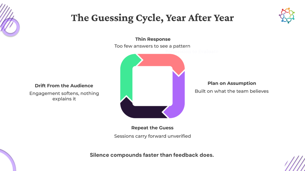
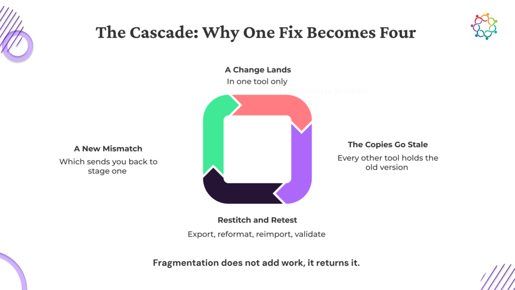
Registration data sits in the event platform and never makes it into a CRM or a segmentation list beyond that one event, so the person who raised their hand is invisible by the next campaign. Feedback gets read for a single post-event summary and then never referenced again, even though it often repeats across events in ways worth noticing. And engagement signals, which sessions someone attended, which connections they made, never get tied back to that person’s record, so the next touch with them starts from zero. By the time anyone wants to use it, the person has been re-marketed to as if the event never happened.
The common thread is that none of this needs new technology to fix. It needs a decision, made before the event, that the data will land somewhere it can be used again, which usually means tying event data to the CRM. For most teams, that’s a matter of the integrations they already have, not a new system. The fix costs a decision, not a purchase. Assuming more events will fix it is the trap; volume without capture just means more data evaporating faster.

Capturing this well isn’t a technology project. It’s a set of small defaults, decided up front. Get them right and capture stops being a post-event chore and starts being automatic.
The event attendee app is usually where this comes together, because it’s the one touchpoint present at registration, during every session, and through the interactions in between, which is the broader case for treating the event app as the hub rather than one more tool. The difference shows up months later, when a sales conversation opens with “you were at our security roundtable and asked about SOC 2” instead of a cold reintroduction. That line lands because the data behind it was captured the day it was created, not pieced together from memory a quarter later.

An event already produces registration detail, interest signals, engagement, feedback, and relationship data. All of it first-party, all of it owned outright, all of it sitting there, whether or not anyone does something with it.
So the real work happens before the next event: decide that this data gets captured somewhere it can be used again, and the person who spent a day with your brand stays known long after they log off. Most of what you’d want to know about them, they already showed you at the event, so capturing it is what lets the next conversation pick up where that one left off. The event already did the expensive part; keeping the data is the cheap step.
If you’re weighing where that capture should happen in practice, it’s worth a short walkthrough.
The whole year, mapped in one sitting.
Planning next year’s events one calendar invite at a time is how things slip through the cracks. Map the whole year first.
Before a single event goes on the calendar, five things need mapping across the year: the revenue goal each event serves, the format, the owner, the budget, and how they sit relative to each other across the year, not just one at a time. Get those on one page and next year stops being a scramble.
The failure mode is familiar. A team running ten or more events a year, planning each as it comes, ends up duplicating effort, clashing dates, and spreading budget unevenly, because no one ever looked at the whole year at once.
Below: the checklist of what to map, how to lay it into a calendar, and a fillable annual planning template so the mapping doesn’t start from a blank spreadsheet.

Five things need to exist on paper before a date gets booked. Each one is concrete enough to act on today, and skipping any one of them tends to come back as a problem later in the year.
Not a vague brand-awareness line, a number: new revenue, account engagement, or renewal support, stated per event before it’s scheduled. “Book 30 sales meetings” or “source 500,000 dollars in new deals” both work, framed as SMART targets, the way a strategic event calendar is built. “Raise awareness” doesn’t, because you can’t plan a calendar around it.
Field events, webinars, flagship conferences, and executive roundtables each pull different effort and return different outcomes. Mapping the mix stops a year drifting toward whatever format spins up fastest. A year that’s accidentally 80% webinars is a default nobody actually chose.
Not a team, a person accountable for that event’s outcome, assigned when you set the owner at the planning stage, rather than after the date is locked. “TBD” now becomes a scramble later; a name now means someone owns the result from day one.
A single annual total hides which events are overfunded and which are starved. Breaking it out per event, the way an event budget planner forces you to, surfaces the tradeoff conversation early, while there’s still room to move money. A number per event also keeps the annual total honest, because it’s built from real commitments rather than a round figure someone hoped would cover the year.
Mapped across the year, not quarter by quarter, so two major events don’t land three weeks apart competing for the same sales team’s attention and the same prospect’s calendar. Read the year top to bottom and the clusters jump out before they become a conflict, so nobody has to choose, three weeks out, between two events that both deserved a clear run.
Common trap: approving an annual budget total without breaking it into a per-event figure. A lump sum feels like planning; it’s really just permission to plan later, event by event, under pressure, which is exactly the pattern this exercise is meant to break.

The mapping becomes a document the moment it has a shape. Use one row per event, with the twelve months running across the top, so every event has a fixed place on the timeline instead of living in a separate file per quarter.
Each row carries the same handful of columns.
A finished row reads in a single line: Q2 customer roundtable, roundtable format, goal of 15 open opportunities engaged, owned by Priya, budget of 8,000 dollars. Fifteen rows like that, and the year is a plan you can defend rather than a hope you’re carrying in your head.
Then read the calendar sideways. Once every row is filled, the spacing problem becomes visible immediately: clusters and gaps show up on the page instead of surfacing as a scheduling conflict three weeks out. A gap in Q3 is as useful to see as a cluster in Q2, because an empty stretch is either a deliberate breather or a missed quarter, and the page tells you which.

So why do so many teams skip it? The honest reason is time. Mapping a full year up front takes a real block of focused attention, and the next event is always more urgent than the year as a whole, so the whole-year exercise keeps losing to the next deadline. The urgency is real, and it almost always favors the fire in front of you over the year as a whole.
The cost of planning event by event is easy to underrate. Effort gets duplicated as each plan is rebuilt from scratch. Budget gets spent unevenly because no one can see the full year’s allocation at once, which is exactly the gap the CFO’s event budget questions are designed to expose. And events land too close together because nobody checked the calendar against anything but itself.
Here’s the reframe. The annual map replaces ten scattered planning moments with one. You make the same decisions, goal, format, owner, and budget, once and in a single sitting, instead of ten separate times at ten separate moments of higher pressure. What makes it doable is having the columns already built, so you’re filling in a template rather than inventing a system from a blank sheet.

A map built once in January and never reopened fails the same way ad hoc planning does, and as a program scales, that gap is part of why teams outgrow execution-only tools. Four habits keep the calendar alive.

Five things to map, one row per event, and a goal, a format, an owner, and a budget for each. That’s the whole exercise, and it turns twelve months of reactive scheduling into one plan you can defend. The map earns its keep in three ways: a year planned in one sitting spends its budget where it counts, spaces its events so they don’t cannibalize each other, and gives every event an owner before the date is set.
Do it once, up front, all the way across the year, and every event after that starts from a plan instead of a blank calendar invite.
Everything above comes pre-built in an editable Annual Event Planning template: a twelve-month calendar with a row per event and columns for format, goal, owner, and budget, plus a one-page visual version for sharing with leadership. Download it below. It takes your first name, work email, company size, and role.
If keeping that calendar current each quarter should be a pull instead of a rebuild, book a walkthrough.
Say Out Loud Where Your Program Stands
Most event teams can’t say out loud where their program really stands. Ask a room of marketers how mature their event function is and you’ll get a shrug, a hedge, or a number that’s a stage too generous. Nobody’s lying; the yardstick just isn’t shared, so everyone measures against a different mark.
Here’s the honest version. Event marketing maturity moves through four stages: ad hoc, repeatable but siloed, managed and measured, and optimized and revenue-linked. Most teams sit a rung lower than they’d guess, because a busy calendar feels like maturity even when the process under it is improvised.
This piece lays the four stages out plainly, shows what each looks like on a normal Tuesday, and ends with a self-scoring assessment that places your team and hands back what to fix first, in order.

Every event program sits in one of four stages. The trick is being honest about which one.
Common trap: assuming a busy events calendar means a mature program. Volume isn’t maturity. A team running twelve ad hoc events a year is still stage one, because the stage is set by process and measurement, whatever the event count.

On paper, the stages sound distinct. In practice, each one has tells.
Read those four back and you’ll feel a pull toward one of them. That pull is the honest answer, and it’s rarely the flattering one.

A label on its own doesn’t help. One clear next move per stage does.
The most common mistake is trying to solve a stage-three or stage-four problem while still sitting at stage one. Trying to prove which events drove revenue before the team even has a shared calendar or a single source of data is building on a foundation that isn’t there. The stage-one work has to exist before the stage-three work can stand on it.

Reading the four stages and guessing sounds easy. Doing it accurately isn’t, for three reasons.
A team close to its own program grades itself on how hard it worked. If everyone worked hard, the program feels mature even when the data trail says otherwise. The stages also look cleaner on paper than in life: most teams sit across two at once, repeatable in one part of the process and ad hoc in another, which makes a single confident label hard to land without scoring it out. And a gut-feel rating is hard to defend upward. A team can feel busy all year and still not be able to say, plainly, where its program actually stands.
A structured set of questions, scored rather than self-judged, replaces the hunch with a defensible answer. And a defensible answer is a far easier thing to take into a QBR or a budget conversation than a feeling.

Four stages, a recognizable version of each, and one fix-first move for wherever you land. That’s the whole diagnostic, and it works because it turns a vague “we should be further along” into a specific next step.
So score it, name the stage without flinching, and put the next unit of effort where that stage says it belongs. The next time someone asks how mature your event program is, you’ll have a straight answer: the stage you’re in, and the one thing you’re fixing because of it.
The full version is built into a self-scoring Event Marketing Maturity Assessment that places your team in a stage and returns a short, prioritized list of what to fix first, pulled from the stage you land in rather than a generic checklist. Take the assessment below. It takes your first name, work email, company size, and role.
If the fix turns out to be getting your event data and your CRM into one place, book a walkthrough.
The shortcut is knowing what to ask, and when.
You don’t need a data team to put AI to work on your events. You need the right prompts and a place to run them.
That distinction matters because most event marketers already have AI open in another tab and still aren’t sure what to do with it. Roughly 88% of marketers now use AI in their day-to-day work, SurveyMonkey found, and yet the blank chat window still wins more mornings than it should.
The best AI use cases for event marketers fall into three jobs: promotion, personalization, and reporting. A sharp prompt for each job turns a task that used to take an hour into one that takes minutes. This has nothing to do with learning a new tool. The skill is asking a familiar one the right question at the right moment in the run of an event.
Ahead: prompts grouped by job, a short note on where each fits, and a full prompt pack at the end so you never start from a blank window again.

This is the busiest stretch of the whole event, the eight-to-two-week window before doors open, when event promotion runs hottest, and the calendar is tightest. Four prompts carry most of the load.
Common trap: running one AI-generated message everywhere without adapting the tone per channel. A LinkedIn voice dropped straight into WhatsApp reads as corporate spam. Reshape the message for each channel every time, rather than pasting the same block across all three.

Personalization at scale is one of the clearest places AI has changed event marketing, and it lives anywhere attendee data already exists: mid-funnel nurture, agenda building, and the quiet stretch right before the event. Four prompts do the work.
The mistake to avoid here is personalizing the greeting but not the content. Swapping in a first name while everyone gets the same body copy reads exactly like the mail merge it is. The prompts above change the message itself, so each segment gets copy actually written for it.

These close the loop after the event, in the week when the report is due and the numbers are sitting in three different exports waiting to become something readable. Four prompts get you from raw data to a first draft.
The one thing to never ask AI in this job is to invent numbers or fill gaps in incomplete data. These prompts draft the language around numbers you already pulled; they don’t replace pulling the real ones first. Treat every output as a draft to check, not a report to send.

None of these prompts needs data you don’t already have. What you feed them is the same information sitting in a registration list, a CRM export, or your event dashboard: names, segments, session activity, and the numbers from the last event. Nothing new has to be collected.
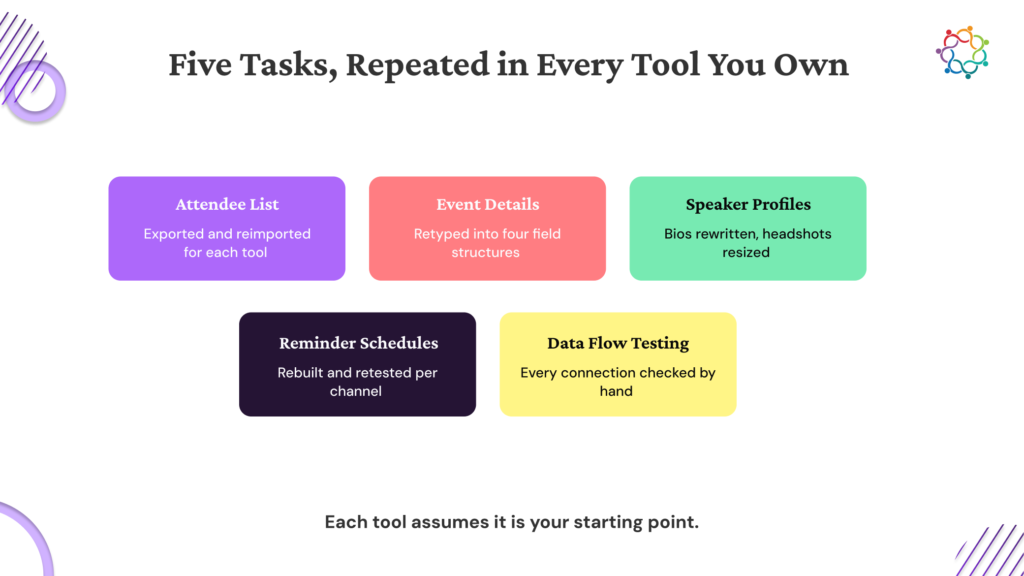
Where it gets easier is when those inputs live in one place. When promotion, personalization, and reporting data all sit inside the same event marketing software the event runs on, the prompts get faster and better, because you’re pasting from one source instead of hunting across five. It’s the same logic behind why B2B teams are replacing their scattered event stack with a single platform: fewer tools, less stitching, cleaner inputs.
One habit holds all of this together. Every prompt drafts a first pass, and a human still reads it before it goes out. AI speeds up the writing. It does not make the judgment call for you.

Three jobs, promotion, personalization, and reporting. A named prompt for each, and a note on where it fits in the run of an event. That’s the whole toolkit, and it works because it meets AI where your work already is.
So the next time a launch lands on your calendar, open the prompt that already fits the job, fill in your event details, and start from a first draft. The blank chat window stops being where the work begins.
Everything above comes pre-built in the AI Event Marketing Prompt Pack: twelve copy-paste prompts organized by job, each with a one-line note on where it fits in the event run. Download it below. It takes your first name, work email, company size, and role.
To see where your promotion, personalization, and reporting data already live on one platform, book a walkthrough.
The readout is already built before the question lands.
It’s Thursday morning. The event wrapped Tuesday. A message lands from two levels up: how did it go? You have a folder of exports, a badge-scan file, a survey still trickling in, and a spreadsheet you don’t fully trust. What you don’t have is an answer you can send in ten minutes.
Here’s what leadership rarely says out loud: the answer is smaller than most reports assume. They want six things from an event readout: the business outcome, the cost against the return, where the deals stand, a short read on sentiment, an honest note on what worked and what didn’t, and a recommendation. Know those six, and the report stops being a research project.
It rarely takes three days because of the writing. The pieces live in five tools and a spreadsheet nobody trusts, so gathering them is the whole job. Ahead: the six answers, how to lay them out slide by slide, and a template so you never start from a blank page.
Most event reports fail for the same reason: they show everything the team tracked instead of the few things the person reading has to know. Get the list right and the report almost writes itself. Here are the six, in the order they belong on the page.
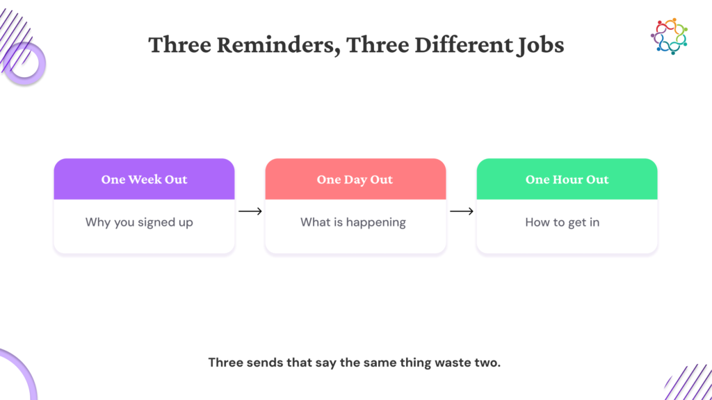
Not attendance, not impressions, not scans. What did this event do for revenue, deals, or named accounts? This is the headline, and it belongs at the top, not on slide six, where nobody scrolls to find it. If a leader reads only one line, this is the line.
One clean cost figure next to one clean outcome figure. When the two sit side by side, the efficiency reads in seconds and nobody has to redo the math you already did. Side by side is doing the work here; the moment those numbers land on separate slides, the comparison is gone.
New opportunities opened, existing ones that moved forward, and the named accounts that engaged, current and specific, with no guesswork. If the event drove new deals, but nothing has closed yet, report the leading indicators that point to revenue, rather than a closed number; the calendar guarantees are still zero.
One or two lines on attendee sentiment or feedback, kept deliberately brief. This is context, and it earns its place only when it stays short. A full paragraph here is a signal that you are reaching for something positive to fill space.
One thing to repeat, one thing to fix, stated plainly. A report that names a weak spot is trusted more than one that reads like a victory lap, because everyone in the room knows no event is flawless, and that honesty is what makes the rest believable.
Run it again, change the format and shift the budget. Leadership does not want to draw this conclusion on your behalf; they want you to hand it over, already made. The recommendation is the reason the report exists, and it is the piece most people forget to include.
Leave the rest out. Treating the report as a place to prove how much you tracked is the fastest way to bury the six answers that matter. A readout that shows all the data looks thorough on the way in and reads as noise on the way out. Report the six and keep everything else in the appendix nobody opens.

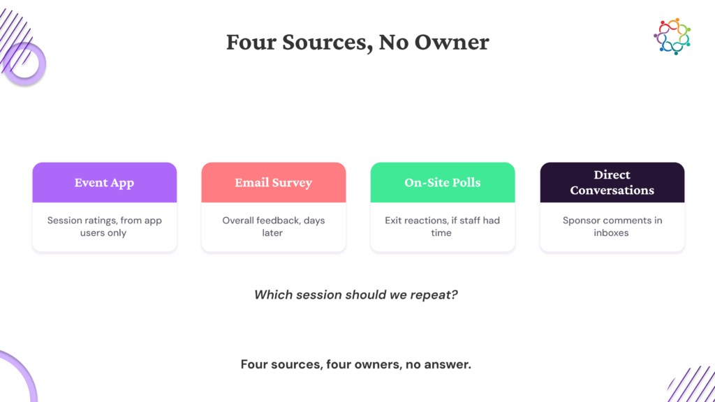
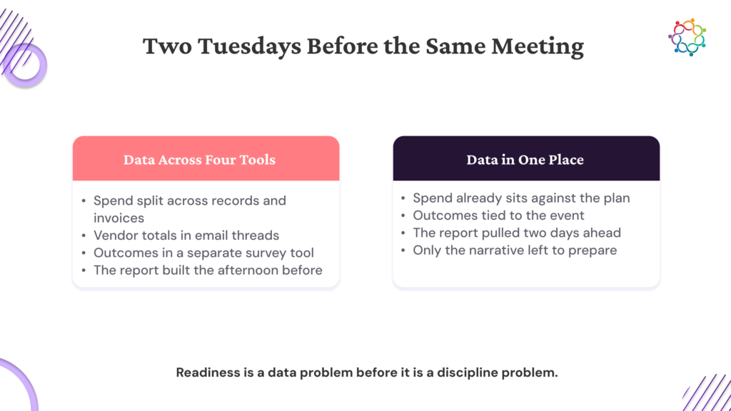
Look at where the six pieces usually live. Registration sits in one tool. Engagement sits in another. Deal data sits in a CRM that someone in sales owns and you have read-only access to. Sentiment sits in a survey tool. Cost sits in a spreadsheet that a finance partner updates on their own schedule.
Six answers, five logins, and a reconciliation step before a single slide gets built. That is where the three days go. And the pull of manual data work is not unique to event teams: in a 2022 Treasure Data survey of 500 senior marketers, respondents reported spending an average of 14.5 hours a week just managing customer data collection, and nearly one in five (18%) spent over 20 hours on it.
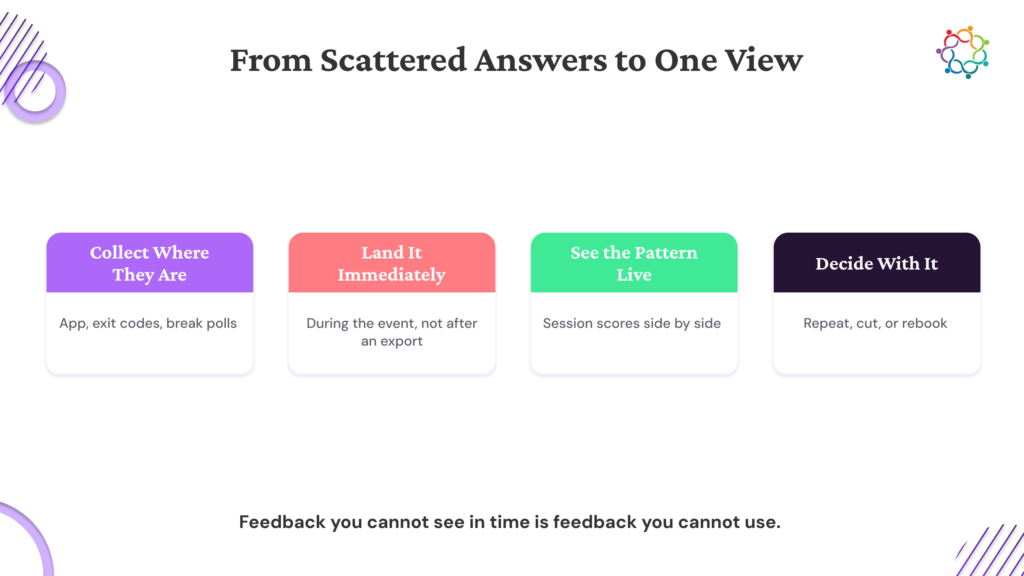
The real fix has nothing to do with working faster. When the event runs on a single event marketing platform, the six answers already sit in one place, so building the report becomes a fill-in-the-blanks exercise instead of a data hunt. For the pieces that have to stay in your CRM or your finance sheet, integrations keep them flowing into the same view, so you’re reading one screen rather than stitching five together by hand.

Here is how the six answers become a document a leader can read in under two minutes.
That’s six answers on five slides, by design: the honest read and the recommendation share the final slide because a weakness and the decision it drives belong in the same breath. One idea per slide, plain language throughout, readable start to finish by someone seeing it cold. The principle underneath the layout is a structured story over a data dump, the same discipline behind a strong post-event evaluation report.

A report is as much about what you leave out as what you put in, and three habits weaken it fast.
The first is vanity numbers with no business tie: total impressions, total scans, total registrations, shown on their own. They pad the deck and dilute the six answers that matter, and the metrics that earn a place in a leadership report are a short list, not the full export. The second is a wall of charts with no headline. If a slide needs you to explain it out loud, it hasn’t done its job on the page. The third is quietly the most costly: ending on data instead of a decision, which hands leadership the thinking you were supposed to do. That is the whole difference between reporting the numbers and recommending something from them.
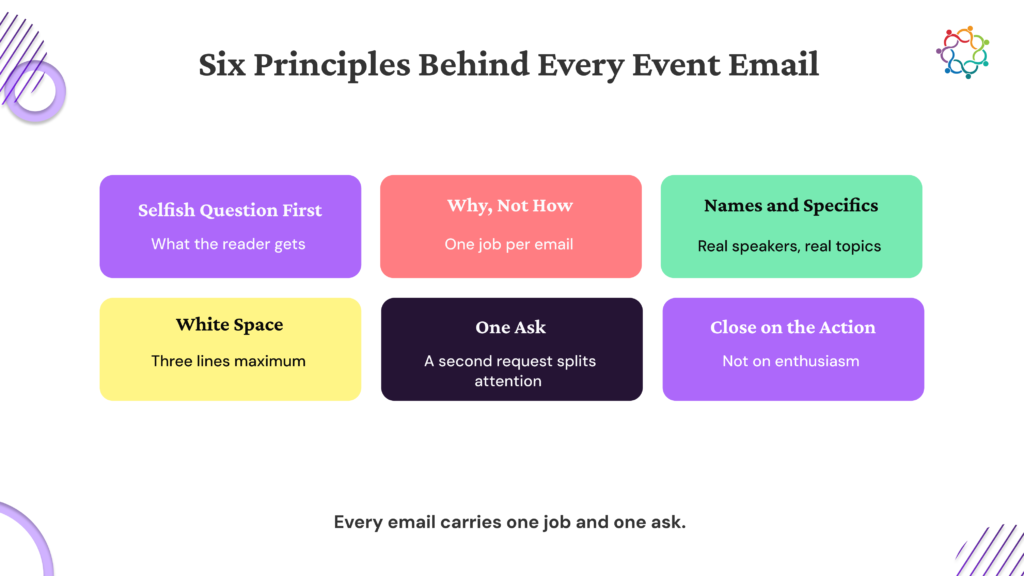
And resist the pull to add slides when the headline number feels soft. It never reads as thorough. Length reads as padding, and padding quietly tells the room you couldn’t find the proof.
Six answers, one page or a handful of slides, and a recommendation at the end. That’s the entire report, and it holds up in front of anyone above you because it was built to answer the one question they always ask.
So the next time that Thursday message lands, you don’t start digging. You open the file that is already there.
Everything above comes pre-built in the Executive Event Report template: an editable slide deck laid out in the order leadership reads it, plus a one-page printable summary for the times a deck isn’t the right format. Download it below. It takes your first name, work email, company size, and role.
To see the six answers come together while the event is still running, book a walkthrough.
The questions are predictable. The answers should be ready.
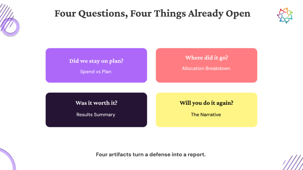
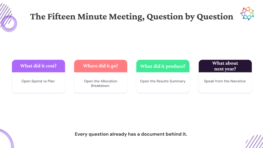
It is annual planning season, and you have one meeting to keep next year’s event marketing budget. The person deciding is the CFO, not your CMO. They will not ask how the keynote landed or whether the booth looked good. They will ask what the events cost, what they returned, and why the money should not go somewhere else.
The good news is the questions are predictable. A CFO’s questions about event spend fall into five groups: what the events cost per outcome, what they returned, why events instead of another use of the budget, whether the result repeats, and how you know the event caused it. The bad news is that most marketers walk into this meeting having prepared a recap of what happened, when the CFO wants answers to those five things.
This piece walks through all five groups, the specific data to have ready for each, and the way a CFO reads your answers. The full bank of all 20 questions, grouped and answered, is at the end. Treat the meeting as a known exam. The questions are sitting right here. The only variable is whether you walked in with the answers.

The instinct is to treat this meeting as an ambush to survive, and to hear every question as an attack on events. That instinct is what loses the budget.
Reframe it. The CFO is not attacking events. They are allocating a fixed, often shrinking, pot of capital, and their job is to de-risk every dollar of it. Gartner’s CMO Spend Survey found marketing budgets down to 7.7 percent of company revenue, from 11 percent before the pandemic, with only about a quarter of CMOs saying they have enough to fund their plans. When the pot is that tight, finance has to interrogate every line. That scrutiny is the role doing its job, and it lands on every budget request the same way, events included. That is also exactly why the questions are predictable. The lens is the same in every budget meeting, which is what makes it possible to prepare.
So change what you prepare, because that is what changes how you defend event spend in a budget review. A recap describes the event: attendance, highlights, and how it felt. A budget defense answers what finance will actually ask, and those are two different documents. The marketer who anticipates the questions and walks in with the number reads as a peer who thinks like finance, and that is how a budget gets protected year after year, rather than rescued once.
There is a quieter reason most marketers cannot answer on the spot. The data is scattered across the tools that ran the event, and assembling it takes weeks. The fix is to have the answers already in hand when the meeting starts, instead of reconstructing them under a deadline.
The trap to avoid is bringing the post-event recap deck and expecting it to double as the budget defense. It covers the wrong material and misses the questions that decide the budget.

A CFO almost always opens with cost, and they mean the fully loaded cost rather than the sticker price. The real question is what the event cost in total, and how efficient that was per outcome. Expect questions like “What did this event cost us all in, including team time?” and “What did each qualified opportunity end up costing?”
If you bring one thing to a marketing budget meeting, make it cost in two layers:
A CFO thinks in unit economics, so the per-unit figure is the one that lands. Bringing cost per qualified opportunity, rather than a single large total, shows you already do the math the way they do.
The trap here is quoting only the visible line item, the sponsorship fee, and getting caught when the CFO adds the hidden costs themselves. Travel, the booth team’s week, the content produced for the stand, all of it belongs in the number. Bring the fully loaded figure first, before anyone has to ask for it. It signals that you are not rounding down to make events look cheaper than they were.

Cost handled, the CFO turns to the return, what came back, in the pipeline and in closed revenue and when. Expect “How much pipeline did this create?” and the sharper follow-up, “How much of it has actually closed?”
Have ready the opportunities the event created and advanced, with values attached. The honest complication is timing. This is really the question of how to present event ROI to finance when the close is still months out. In most B2B cycles, the deals an event influences close well after the event, often after the budget meeting itself. When nothing has closed yet, do not paper over it. Bring the leading indicators, meetings booked, opportunities created, deals that moved a stage, and pair each with the window in which the closed number is expected to land. Honest timing beats an inflated figure, because a CFO has seen inflated figures before.
This is exactly what a pre-close event recap is built for, reporting an event’s return before the revenue arrives. That recap is the artifact that already holds these answers, so the budget meeting becomes a matter of opening it instead of rebuilding it.
The trap is leading with a big “influenced pipeline” number that has no closed revenue behind it and no date attached. To finance, an influential number with no timeline reads as marketing math, the kind of figure that invites more scrutiny instead of less. Any leading number you bring should travel with the date the real one arrives.
This is the opportunity-cost question, and it is where many marketers get stranded. The CFO is splitting a fixed budget, so the real question is why this money belongs in events instead of paid, content, or another hire. Expect “How does event ROI compare to our paid channels?” and “What would we lose if we moved this budget to demand gen?”
The core of how to justify an event marketing budget to a CFO has two parts. First, a like-for-like efficiency comparison: your event cost per opportunity set directly next to the cost per opportunity from your other channels. Second, the strategic point a spreadsheet misses is what events do that no other channel can:
To a CFO dividing a fixed pot, “events are valuable” loses to “events are more efficient than channel X for this segment, and they do something no channel can.” Bring the comparison and the distinction together. One without the other is half an answer.

A budget is a forecast, so the CFO needs to know the return repeats. The real questions are whether this was a repeatable engine or a lucky one-off, whether you can predict next period, and how far to trust your figures. Expect “Was this a one-off, or can you predict next quarter’s return?” and “How confident are you in these numbers?”
Three things answer this. Show a trend across several past events, so the result reads as a pattern rather than a single lucky point. Separate clearly what is predictable from what is variable, the reliable floor against the upside that depends on the specific event. And give honest confidence ranges in place of suspiciously exact figures. A CFO trusts a stated range, “we would commit to this floor, with upside to here,” more than a single number carried to two decimal places.
This is the heart of defending an event marketing budget to leadership over time. A budget survives on a credible forecast of the next several quarters, more than on a single strong one.
The trap is taking one excellent event and projecting it forward as the baseline or presenting estimates as though they were measured facts. Over-confidence costs you a CFO’s trust faster than a candid “here is the range we are willing to stand behind.” Once a number looks too good, every number you bring after it gets discounted.

This is the skeptical question, and the one where overclaiming does the most damage. The CFO wants to know causation: were these deals you would have won anyway, and how exactly are you crediting them to the event? Expect “Aren’t these accounts we’d have closed regardless?” and “How are you attributing this pipeline to the event specifically?”
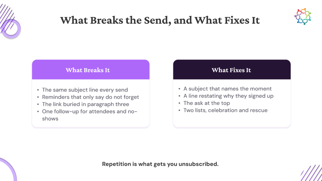
Here is how to answer the hardest CFO questions about events. Bring three things, and keep them plain:
Naming what you cannot claim builds more credibility than claiming everything, because it tells the CFO you are reading the data straight. The same attribution discipline runs through our Event Sponsorship Measurement Framework.
The trap is claiming the event was the sole cause of every deal it touched. Overclaiming hands the CFO a clean reason to discount the whole number: if one claim is obviously inflated, why trust the rest? Claim the influence you can defend, concede what you cannot, and the number you are left with carries more weight than a bigger one nobody believes.
The questions are not a mystery. They fall into five predictable groups: cost, return, comparison, repeatability, and causation, so the work is to prepare the data for each group before you walk in.
The marketer who keeps the budget is not the one with the best event. It is the one who walked into the room already holding the answer to every question the CFO was going to ask.
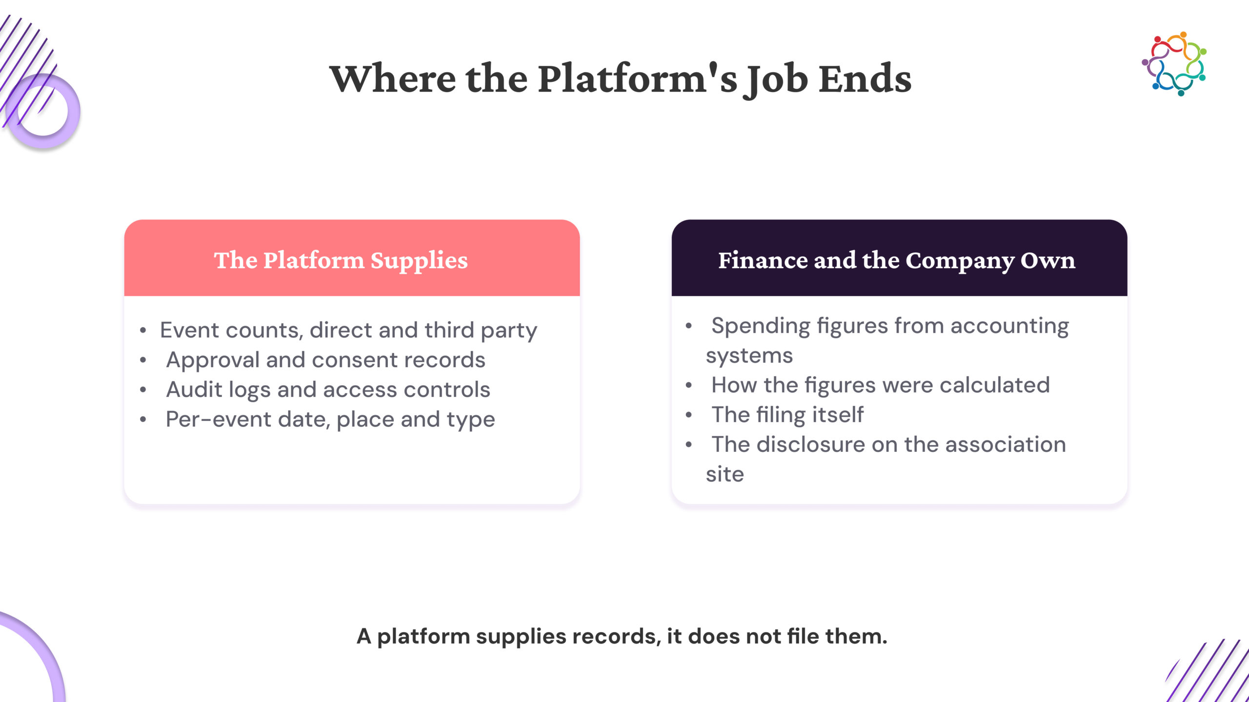
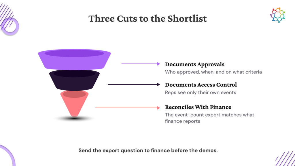
All 20 questions, grouped the way a CFO thinks, each with the data to have ready and a sample answer you can adapt, are in the full CFO Event Budget Question Bank, along with a one-page prep checklist for your next budget meeting. It takes your first name, work email, company size, and role.
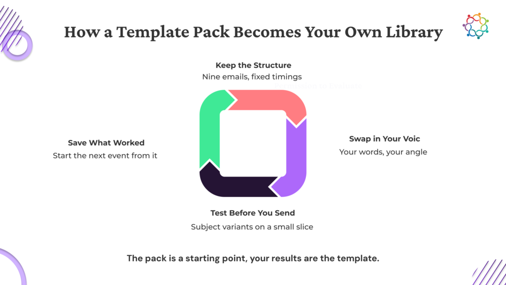
To see how running events in one place keeps these answers ready instead of scattered across tools, book a walkthrough.
Stop presenting a list of events. Present one program.
You ran a handful of events this quarter: a user conference, a couple of field dinners, a webinar, and a partner roadshow. Different sizes, different stages, each with its own recap sitting somewhere. Now it is QBR day, you have one slot, and leadership wants one answer to one question: what did the event program do this quarter?
A good marketing QBR template answers that by rolling the events into a single program story instead of touring them one by one. The logic is a sequence: pick the one number the whole quarter ladders to, aggregate very different event types fairly, show the quarter-over-quarter trend, and close on what is still in motion and the plan for next quarter.
Recapping one event is the easy part. The hard part is making several different ones add up to a single, defensible story. This piece walks through that synthesis logic, then lays it onto a five-to-seven slide template with a filled-in example you can reuse before every review. Most marketers walk in with a stack of event summaries and leave the room having made leadership do the math. The aim here is to walk in with the program already added up.

The default is a slide per event: a tour through the conference, then the webinar, then each dinner in turn. That is a stack of recaps, and a stack of recaps is not a review.
It fails for a specific reason. It makes leadership do the synthesis themselves, adding the events up in their heads to work out what the program did, and they will not do that work. So the quarter reads as a pile of activity rather than a coordinated bet. A list of events looks like busywork. A program looks like a strategy. That gap is the whole game, because Gartner found that only 52 percent of senior marketing leaders say they can prove marketing’s value and get credit for it, with CFOs and CEOs ranked as the executives most skeptical of that value. The QBR is the room where you either close that gap or widen it.
So reset the unit. A QBR measures the whole program across the quarter, and each event is a component of that program. That single framing is how to report on an event program quarterly without it sliding back into a list. The deck answers one question once: what did the event program contribute this quarter? The per-event detail still exists and still matters; it just lives in the individual recaps. Those recaps are the input. This quarterly story is the output. For how to build the single-event recap that feeds this roll-up, see our B2B Field Marketing Playbook which sets the wider program context.
The trap is treating the quarterly deck as a folder of event recaps stapled together. The moment leadership sees the event calendar as the agenda; the program has already lost its framing.

Before anything rolls up, the quarter needs one headline number that the whole program ladders into. A deck with a different metric for every event has no through-line, and the review fragments into the same event-by-event tour you were trying to leave behind. A deck where every event feeds one number tells one story.
Choose that number on two criteria. It should be an outcome leadership already cares about, and it should be one that every event type can contribute to, so a small dinner and a large conference both ladder into the same figure. Qualified pipeline created across the program, or opportunities the program advanced, both work. Attendance does not, because a dinner and a conference contribute to it on wildly different scales.
That choice sets the discipline for everything after it. Every slide that follows has to support that number. If a slide does not ladder to it, the slide belongs in a different deck. That is most of what to include in a marketing QBR, and most of what to leave out.
The trap is choosing a vanity figure as the spine, total attendance summed across every event. It is a bigger number that means less, and the whole deck inherits the weakness, because a spine built on an activity count cannot carry an outcome story. The spine has to be an outcome that the business already values.

Here is the part a single-event recap never has to handle, and it is how to roll up multiple events for leadership without flattening them: a conference, an executive dinner, and a webinar are not the same kind of thing and adding them up naively misleads. Rolling them up fairly takes three moves:
Done this way, leadership sees a balanced program, reach paired with depth and understands why the mix exists. The alternative is a slide where one big event towers over a row of small ones that look like waste.
The trap is comparing every event on a single volume metric, where the biggest event always wins and the small, high-value ones look like a poor use of budget. That misreads the program and gets exactly the wrong events cut, the intimate dinner that opened a seven-figure account quietly axed because it drew twelve people.

The last section aggregates within the quarter. This one compares across quarters, and it is the axis a single-event recap can never show. A QBR audience wants direction even more than it wants one quarter’s totals: Is the program getting better?
Show it with the same spine number across the last several quarters, the direction of travel, and a one-line reason for any move. Quarter-over-quarter is the comparison that belongs in a review. This is the clearest way to show event ROI in a QBR, because a single quarter’s number is a dot, and the trend is the line. Leadership funds a line heading the right way far more readily than a dot it cannot place in context.
Be honest about a down quarter. A dip with a clear cause and a stated correction reads as a program under control. A dip with no explanation reads as a problem you have not noticed yet. The trend slide is where candor earns trust, so use it that way.
The trap is presenting only this quarter’s totals with no prior quarters at all, which leaves leadership unable to tell whether the program is climbing or sliding. A total with no trend is half a story at a review, and the half that is missing is the half leadership cares about most.

Now lay the logic onto the actual deck. Here is how to build a marketing QBR deck for the event program: five core slides with two optional ones, each slide doing one job.
A few construction rules hold it together. Slides 1 through 5 are the core; six and seven get added when the quarter warrants them, which is how this quarterly event review template flexes from five to seven. One number leads each slide, and the rest of the slide supports it. The order is fixed: the answer, then the breakdown, then the trend, then the accounts, then forward. And every slide stays skimmable, because the event program gets one slot in a packed QBR.
The trap is opening with the event calendar or the logistics instead of the spine number, which buries the answer behind the setup. Lead with the answer. The breakdown earns attention once the answer is on the table.
The program section said build a program. This one guards the other end: the ways a roll-up quietly collapses back into the list you were trying to escape.
It happens in a few predictable ways. A slide per event undoes the whole roll-up and turns the deck back into the tour. Per-event detail overload, every event’s metrics dumped onto the deck, drowns the program story, and that detail belongs in the individual recaps. Slides that do not ladder to the spine number turn the deck into a scrapbook. And vanity roll-ups, total impressions or registrations added up across events, hand you a big number that says nothing. If you have seen marketing QBR deck examples that fall flat, most of them do at least one of these.
The discipline is simple to state: every slide ladders to the spine number, the trend is present, and per-event detail is linked rather than shown. This deck also has to survive the finance questions leadership will bring to it, so build it to answer them, and the same measurement discipline runs through the Event Sponsorship Measurement Framework.
The instinct that does the quietest damage is trying to give every event its fair share of airtime. The deck’s job is clarity for leadership, and the events that carry the story are the ones that earn the slide time. The rest live in the appendix or in their own recaps.
Pull it together. One program built from the quarter’s events. One spine number the whole quarter ladders to, a fair roll-up of different event types, the quarter-over-quarter trend, on five to seven slides.
Leadership does not remember the quarter as a list of events. They remember it as one number going the right way, or the wrong one. The QBR deck is where you decide which.
The five-to-seven slide template, along with a fully populated example quarter so you can see what good looks like, is in the Quarterly Event QBR Deck. It takes your first name, work email, company size, and role.
To see how running every event on one platform makes this roll-up trivial instead of a quarter-end scramble, book a walkthrough.

Samaaro is an AI-powered event marketing platform that enables marketing teams to turn events into a measurable growth channel by planning, promoting, executing, and measuring their business impact.
Location


© 2026 — Samaaro. All Rights Reserved.